| |
The Visual Identity of "Falcon Crest"
An overview by THOMAS J. PUCHER, President of DFCF,
with a statement by Emmy winner BILLY PITTARD, creator of the "golden Crest design".
Among its many outstanding qualities, "Falcon Crest" is also famous for its unique main titles.
The show's logo, the falcon coat of arms, has always had a maximum value of visual identification.
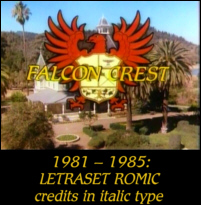 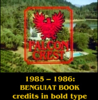 After using the initial red-white coat of arms and the yellow "Letraset Romic" italics for the first four seasons, the first update of the show's visual identity took place in season 5. Whereas red and yellow were kept as the basic colors for the logo and the actors' names, a frame was added around the logo and each actor's picture on the respective card in the main titles; a new elegant typeface, "Benguiat Book", replaced the former font. After using the initial red-white coat of arms and the yellow "Letraset Romic" italics for the first four seasons, the first update of the show's visual identity took place in season 5. Whereas red and yellow were kept as the basic colors for the logo and the actors' names, a frame was added around the logo and each actor's picture on the respective card in the main titles; a new elegant typeface, "Benguiat Book", replaced the former font.
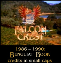 The most striking update, however, occured in the 1986-87 season: The logo was redesigned in the most elegant gold & blue color variation; the "Benguiat Book" typeface, now also appearing gold, was set in small caps; and an outstanding new swirl effect was invented — one actor's card would be smoothly dissolved into the other's in the form of an ellipsis. There is no doubt that this unique opening sequence has become one of the hallmarks of "Falcon Crest". After LORIMAR had changed its post-production photography technique from film to video only approximately half a year prior to the première of season 6, the new design of the main titles was revolutionary for its time. The most striking update, however, occured in the 1986-87 season: The logo was redesigned in the most elegant gold & blue color variation; the "Benguiat Book" typeface, now also appearing gold, was set in small caps; and an outstanding new swirl effect was invented — one actor's card would be smoothly dissolved into the other's in the form of an ellipsis. There is no doubt that this unique opening sequence has become one of the hallmarks of "Falcon Crest". After LORIMAR had changed its post-production photography technique from film to video only approximately half a year prior to the première of season 6, the new design of the main titles was revolutionary for its time.
The classic golden visual identity of "Falcon Crest" was created by design specialist BILLY PITTARD. Season 6 was the first main title ever conceived by the independent design consultant for a nationally broadcast television show. After that, Mr. PITTARD created hundreds of other main titles, five of which have been honored with Emmy awards. Another sixteen have been honored with Emmy nominations. Mr. PITTARD has also been instrumental in forming and revamping corporate identities, such as the German "ProSieben" channel and many others. THOMAS J. PUCHER asked BILLY PITTARD to provide a few pieces of information about the redesign of "Falcon Crest". Here is how BILLY PITTARD describes his work himself in a message to DFCF President THOMAS J. PUCHER dated 03/15/2004:
 "The whole process for the "Falcon Crest" main title took about six weeks from initial contact until final delivery. "The whole process for the "Falcon Crest" main title took about six weeks from initial contact until final delivery.
I had great support from one of the show's producers, Bernie Laramie. We created the title at The Post Group in Hollywood. I also had some great guidance and help from Rich Thorne, who I believe is now the Head of Digital Effects for Fox Films. At that time, Rich was in charge of the creative facilities at The Post Group.
My contribution was to develop the concept, the look, and oversee the production for the main title. [The show being on hiatus,] The cast was unavailable for a shoot so I was limited to working with existing show footage. This meant I needed to develop a treatment that would somehow enhance the existing footage. My solution was the idea of swirling wine in a wine goblet as a conceptual theme for scene transitions.
The swirling wine concept needed a shot to establish the idea, but there was no such shot available. Therefore we put together a small crew and shot the necessary scene of the wine being swirled in a beautiful Baccarat wine goblet. The goblet was a gift from my recent wedding and we did the shot at the home of my new in-laws who also happened to be the owners of The Post Group.
You may notice that the swirling effect has a nice soft edge between the two scenes that it transitions between. That softness was very advanced for the time and was one of the first uses of that capability.
Gold was a natural choice for the color of the text and the crest because it signifies wealth. Gold also stands out well against the live action background.
The basic design of the crest was already in use from the show's previous seasons. All I did with the crest was to give it a richer, shiner, more dimensional feeling. I also gave it a bit of a swoop when it enters the screen to give it a bit of drama. When I added that swoop I was thinking about how a falcon might move if it were landing on a tree branch that sways slightly under its weight."
The main titles of seasons 7 and 8 were also based on the concept by BILLY PITTARD. Even after so many years, these "Falcon Crest" main titles are still a must-see due to their ageless elegance.
The typeface for the show's title was kept for the main titles of seasons 8 and 9 (at least from # 207 on), but suffers from typography errors; check the Behind the Scenes section for # 128 and # 184 for more details.
|
|


